Hello,
In this session, we'll learn how to modify the data legend of the imported CSV data.

Dividing the legend is one of the most important tasks in mapping.
While simply showing the locations like on the Vietnam energy power plant map above may have meaning, classifying them with different colors based on the power generation capacity of each power plant along with the location information would make the data more meaningful.
If you want to see the same text-based data in a CSV file within QGIS, you can right-click on the layer pane > Open Attribute Table to check it.

Then you will see the attribute table window as shown above.
The energy power plant capacity data we will use in this post is in the "Design Capacity (MWe)" column located on the right.
Now, let's divide the legend based on the power generation capacity.
Go to Properties > Symbology tab and this time, click on 'Graduated' instead of 'Single Symbol'.
Select "Design Capacity," which is the indicator for setting up the legend, in the Value.
The easiest way to create a legend is to click the "Classify" button at the bottom left and change the Mode above it. The Equal Count (Quantile) and Natural Break (Jenks) methods are most commonly used, and you can also add or delete legends by clicking the (+) and (-) buttons, and you can freely change the Value as well. For the legend, since it is the text displayed directly on the map, you can display it only as numbers or include text as shown above.
Here you can also change each symbol attribute such as symbol size, color, and transparency.
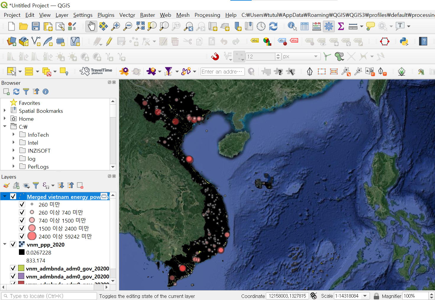
The overall symbol transparency is set to 50%, and each symbol size is applied as 1, 2, 3, 4, 5, respectively.
The locations of power plants with larger generation capacities are more prominent.
So, we've learned how to cset up the data legend.
Thank you.

'QGIS English Guidance > QGIS Basics' 카테고리의 다른 글
| [QGIS Basics] File Conversion (Raster -> Vector) (0) | 2024.04.08 |
|---|---|
| [QGIS Basics] Refactor Fields - Changing the Field Type (0) | 2024.04.04 |
| [QGIS Basics] Playing around with Symbology (0) | 2024.03.27 |
| [QGIS Basics] GIS File Extensions, GIS File Importing (0) | 2024.03.25 |
| [QGIS Basics] Adding Background Maps (Google Maps, OpenStreetMap, etc.) (1) | 2024.03.20 |


댓글